 With the recent update to its Android Application, Foursquare has introduced three major changes to the app. These changes aim to make it easier for users to find the best stuff nearby as soon as they open the app.
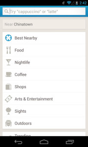
1. Foursquare has built a smoother search experience and moved Explore to the top of the home screen to make it easy to quickly find a place. Users can tap the search bar to find “nachos,” “Mexican,” or “margaritas,” or browse categories like coffee, food, and nightlife. Users can also choose the “Best Nearby” option when they tap the search bar to find top picks for interesting places in the area.
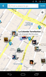
2. Now when users open the app, they’ll see a map up top that shows friends who are checked in nearby, along with recommendations for places that they might like. Users can tap on the map to expand it, and zoom around to see even more of their friends. The nearby friends has been moved to the top of the stream so it’s easy to get a sense of who’s around.
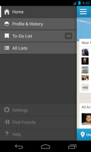
3. Instead of three tabs at the bottom of the app, users will now have a drawer (tap the top left corner of the screen) where they can easily get to their profile, lists, and settings.
Besides these, other changes include the check in button’s new home on the bottom left, a simpler way to add friends, and interesting insights every time users check in.


